To the latest cBioPortal release (v4.1.10), a feature has been added that allows users to visualize clinical attributes in a heatmap when comparing study groups. Studies in cBioPortal have a multitude of clinical attributes, like sex, cancer type, sample type, and primary tumor site. In the Group Comparison page of cBioPortal, users could already visualize these attributes with various bar charts. To these, The Hyve has now added a heatmap option.
Continue reading to discover the advantages of visualizing clinical data using heatmaps.
The Challenge
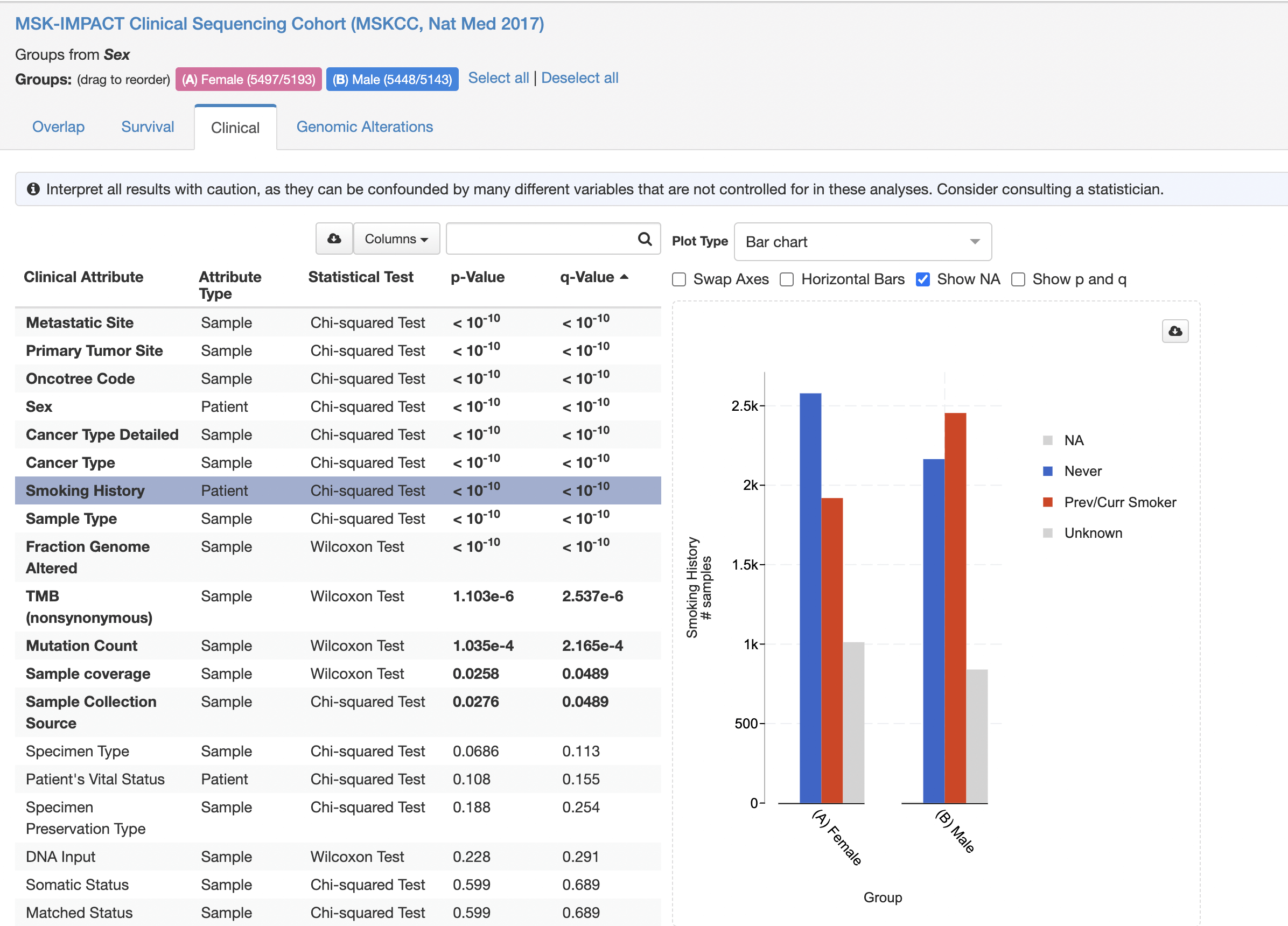
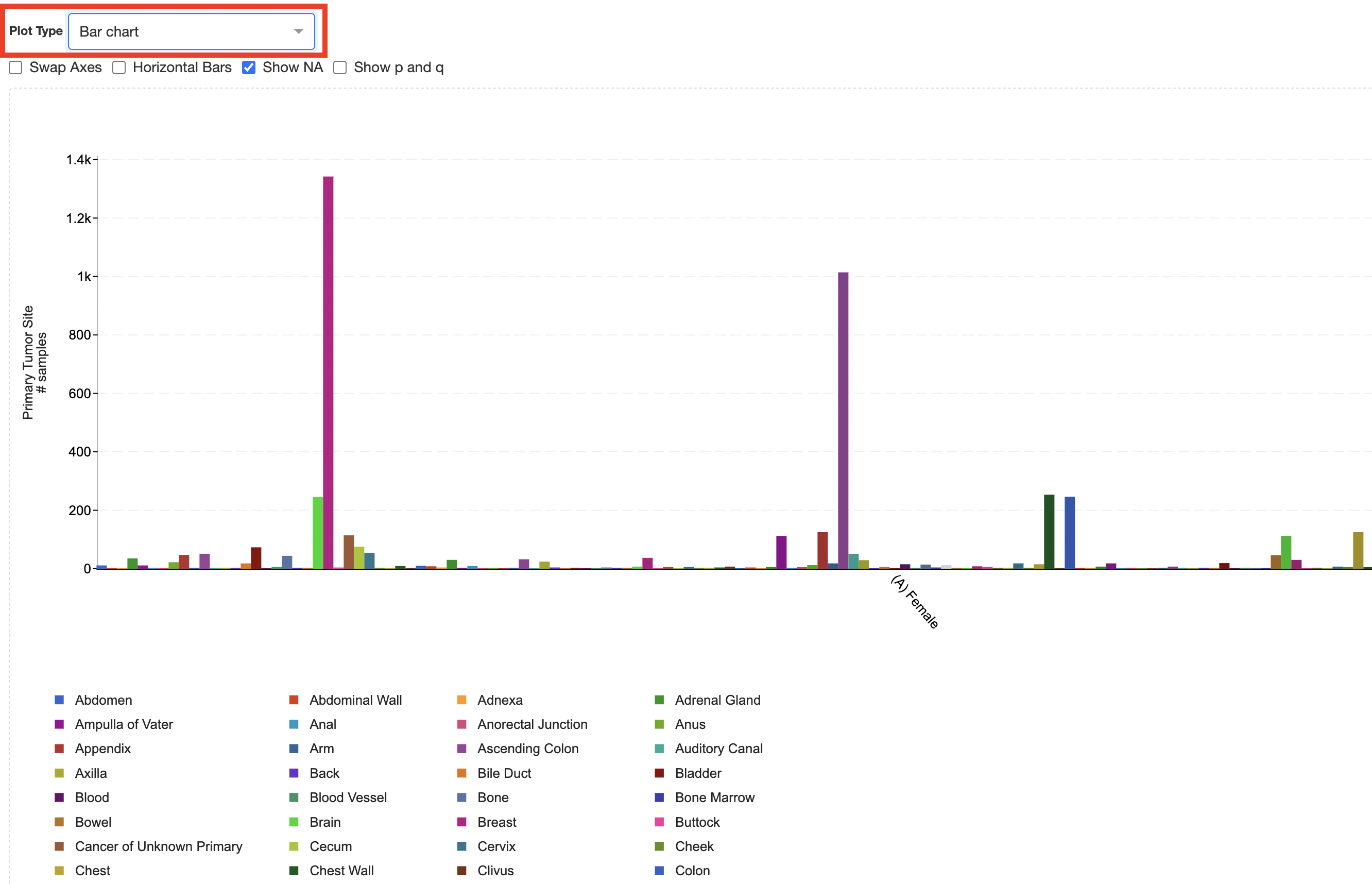
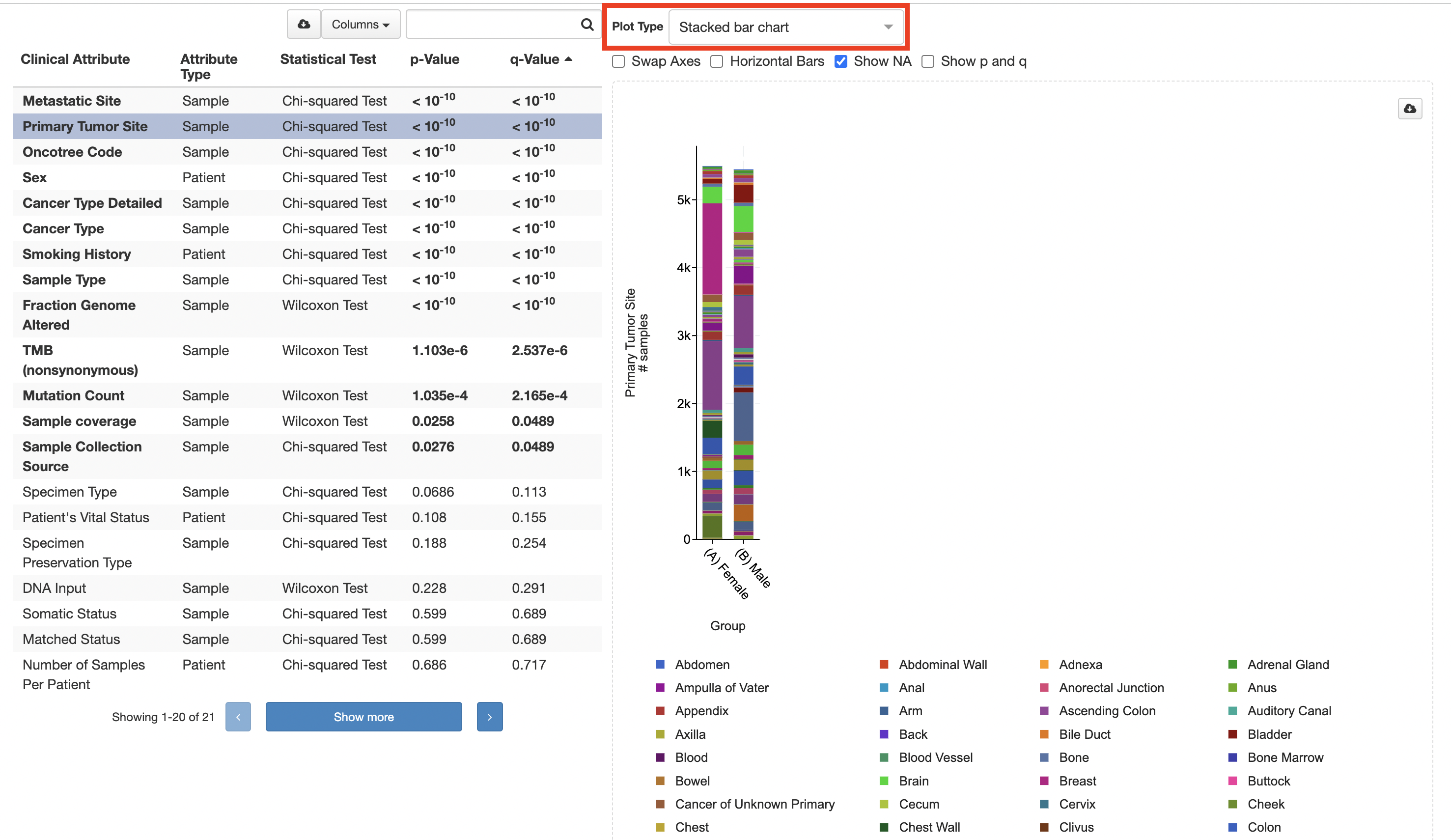
Clinical attribute data can be numerical or categorical, and categorical data can contain any number of categories. In cBioPortal’s Group Comparison, numerical data is usually visualized using a scatter plot and categorical data using a bar chart (Figure 1). However, when handling lots of categories, reading bar charts can become quite cumbersome (Figures 2a, 2b).
Take the MSK-IMPACT Clinical Sequencing Cohort (MSKCC, Nat Med 2017) dataset. cBioPortal’s Group Comparison feature allows users to compare custom groups to one another. You can, for example, compare the patients in this study based on gender. This can be done by clicking on the hamburger icon (three horizontal lines) of the Sex pie chart and selecting the “Compare Groups” option. This will lead you to the Group Comparison between male and female patients for this study. The Clinical tab shows all the clinical attributes that are present in the study compared between the groups that have been created.
How we addressed it
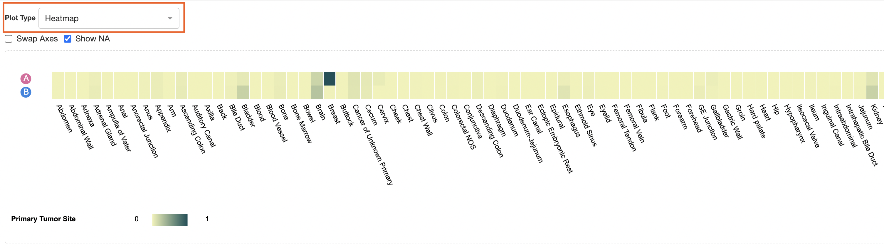
Too many categories clog up a bar chart; this is why we introduced heatmaps.
A heatmap lists the groups on the Y-axis and the categories on the X-axis. The color of the intersecting cell shows the value relative to the highest possible value. Figure 3 gives an idea of what this looks like.
Try it yourself
You can easily recreate the heatmap shown in Figure 3 yourself on cBioPortal. When we return to our group comparison example and click the ‘Smoking History’ row, we get Figure 1. When clicking ‘Primary Tissue Site,’ we get the plots shown in Figures 2a and 2b. When clicking ‘Heatmap’ in the ‘Plot Type’ dropdown menu and selecting ‘Heatmap’ will render us a heatmap (Figure 3).
As for all plots, a heatmap serves a distinct purpose. The differences within a group might be less apparent in a heatmap; however, the differences between groups are immediately visible. For example, try to see what the differences are between males and females in the brain and kidney categories. We can hover over a cell to view the precise value.
Closing remarks
The Hyve provides services to develop, extend and improve features in cBioPortal such as the heatmap described in this article. Implemented features are released to the community via the cBioPortal repository on GitHub. We hope you like this new feature and that it proves helpful in your work. For inquiries on cBioPortal feature development projects or other services concerningcBioPortal, feel free to contact us.


